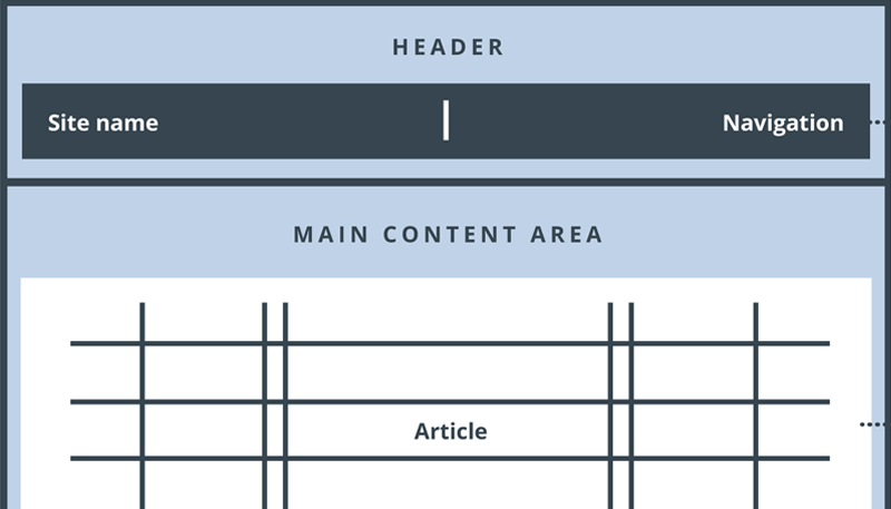
As a web developer, one of the most critical aspects of website design I focus on is navigation. Website navigation is the structure that guides users through the site, helping them find information quickly and efficiently.
When done right, it provides a seamless user experience, but when done poorly, it can frustrate users, leading to higher bounce rates, lower engagement, and lost conversions.
Below, we’ll explore five common website navigation mistakes that can negatively impact the user experience and how to avoid them.
Common Website Navigation Mistakes
1. Overcrowded Navigation Menus
A common mistake is overloading the main navigation menu with too many options. When users are bombarded with too many choices, it can lead to decision fatigue, making it harder for them to find what they need.
Why It’s Frustrating: A cluttered menu can overwhelm users, especially if they’re unfamiliar with the site. They may struggle to locate essential pages, such as your services or contact information.
How to Fix It: Simplify your navigation by focusing on your most important categories or pages. Use dropdowns or secondary menus for less critical pages. Prioritize a clean, easy-to-understand menu structure.
2. Hidden or Non-Descriptive Menu Labels
Using unclear, vague, or creative labels for menu items can confuse users, making it difficult for them to know where to click. For example, using jargon or industry-specific terms instead of standard labels like “About Us” or “Contact” can disorient visitors.
Why It’s Frustrating: Users don’t want to spend time deciphering what each menu item means. If they can’t find what they’re looking for quickly, they’re more likely to leave your site.
How to Fix It: Use clear, descriptive labels for each menu item. Stick to conventional language that visitors understand, such as “Home,” “Services,” and “Blog.”
3. Lack of Mobile-Friendly Navigation
With over 50% of global web traffic coming from mobile devices, failing to optimize your navigation for mobile users is a major mistake. If the navigation isn’t responsive or mobile-friendly, users will have difficulty browsing the site on their phones or tablets.
Why It’s Frustrating: When menus aren’t optimized for mobile, users may experience issues such as buttons being too small to click, menus not opening properly, or horizontal scrolling, all of which lead to frustration.
How to Fix It: Ensure your navigation is responsive and mobile-friendly by using a hamburger menu or other mobile-optimized design features. Test the menu across various screen sizes to ensure smooth navigation on all devices.

4. Missing Search Functionality
For larger websites with extensive content, not including a search bar is a significant mistake. Users who can’t find what they’re looking for in the main menu often rely on a search function to quickly locate specific pages or information.
Why It’s Frustrating: Without a search bar, users may struggle to navigate through content-heavy sites, wasting time scrolling or clicking through menus.
How to Fix It: Add a prominently placed search bar, preferably in the header or near the navigation menu. Make sure it’s visible on all pages, and consider adding features like autocomplete to enhance usability.
5. Broken or Inconsistent Links
Another common navigation error is broken or inconsistent links. When a user clicks on a link and it leads to a 404 error or the wrong page, it creates a negative experience. Inconsistent links, where the navigation changes from page to page, can also confuse visitors.
Why It’s Frustrating: Broken links disrupt the user’s journey, leading to frustration and decreased trust in your site. Inconsistent links force users to re-learn the navigation, which can be confusing and time-consuming.
How to Fix It: Regularly audit your site for broken links and fix them promptly. Keep the navigation structure consistent across all pages to provide a seamless user experience. Tools like Google Search Console or Screaming Frog can help identify broken links efficiently.
Conclusion
Website navigation is a critical component of user experience, and making these common mistakes can significantly frustrate users and drive them away from your site.
To keep visitors engaged and improve overall site performance, ensure your navigation is simple, intuitive, and mobile-friendly. By avoiding overcrowded menus, using clear labels, providing search functionality, and fixing broken links, you create a website that’s easy to navigate and optimized for both user experience and SEO success.
Fixing these navigation issues can not only enhance the user experience but also improve your site’s conversion rates and SEO rankings, ultimately benefiting your business in the long run.